Title

Extras


Official Symbol of The American Revolution Bicentennial: Guidelines for Authorized Usage; Official Graphics Standards Manual

Designed by Bruce Blackburn, 1974
Limited Edition of 1,976


Extras

From coffee cups to cushions, the symbol was everywhere.

View the scans

Memorabilia

From coffee cups to cushions,
the symbol was everywhere.

Original Manual

View the scans

Foreword and essay

“It was the president of the United States who said, I want that. And he got it.”

Read the foreword by Bruce Blackburn
and the essay by Christopher Bonanos


A Star Is Born.
by
Bruce Blackburn

In the early 1970s, I was working in New York with Chermayeff & Geismar Associates. Our office, along with several other design firms, was invited by the American Revolution Bicentennial Commission to submit proposals for a graphic identification system to celebrate the 200th anniversary of our nation’s founding in 1776.

What an intimidating challenge… just take 200 years of history and distill them into a form that would make a good lapel pin. Not exactly a piece of cake.

In our office, everyone working on this project kept their own counsel, did their own research, made their own decisions and then finalized their thinking and gave their ideas final form.

Since the time frame was relatively short and business continued as usual, I found that much of the time I could devote to the Bicentennial project was extracurricular and made use of my time on the Long Island Railroad commuter train as a way to capture some uninterrupted think-tank time. At the end of each day, I remember reviewing the notes and sketches I’d made on the pages of that day’s New York Post before returning to everyday home life.

My deliberations led to the following conclusions: to begin with, of all the revolutionary “American” symbols I considered as possible elements in a solution, the only one that passed the historical reference test and, at the same time, could be utilized in a contemporary or “modern” way was the five-pointed star from the Betsy Ross flag. But the star is an aggressive and militaristic form, and the event needed something friendlier, more accessible. Why not wrap the star in stripes of red, white and blue “bunting”, rounding the sharp edges of the star and producing a second star surrounding the original? The two stars also refer to the two American centuries being celebrated.

The final result, of course, is the familiar “soft” star which became one of the proposals we submitted to the Commission.

Our office ultimately submitted 10 or 12 proposals that were then evaluated by a “blue ribbon” panel of design professionals from inside and outside of government. The panel judged my proposal the winner of the competition and it became the official symbol of the American Revolution Bicentennial.

Shortly after this we were asked to complete a design proposal for a Bicentennial commemorative stamp as soon as possible in order to satisfy Postal Service scheduling for production. This became the first and only application reflecting my original intent.

When the program reached the Oval Office for final approval, President Nixon and his men decided that the proposed graphics did not seem “governmental” enough and mandated that the typographic/verbal information be arranged in a circle surrounding the symbol. And so it was.

Developing guidelines for use of the Bicentennial identification was fairly straightforward as almost everything involved refers directly to the design of the symbol and the individual style elements it contains.

As part of the initial phase of implementation and introduction to the public, I had designed several items that became the basis of the Implementation section of the manual. The purpose of this display was to lead by example, demonstrating the Bicentennial identification in actual use, following the guidelines as intended. In addition, the design of the manual itself provides an important and complete exemplar.

The Standards Manual reproduced here provided a needed management tool for the Commission, and became a useful reference for the many designers and communications professionals producing information, products, events and programs affiliated with the Bicentennial celebration. It offers a general overview as well as many specific examples of how to utilize the Bicentennial identification. Altogether, these guidelines were very effective in establishing consistency in applying the Bicentennial identification graphics to a myriad of applications, some expected, others impossible to anticipate.

For me, the Bicentennial program presented an extremely challenging problem, one the likes of which comes along once in a lifetime. It was a distinct honor to have been involved in the process and doubly so to have my proposal for the symbol of the American Revolution Bicentennial become a reality.


The Spirit and Swoop of ‘76.
by
Christopher Bonanos

The preparation for the American Bicentennial was a nationwide moment of cognitive dissonance. In 1976, the United States was going to turn 200, and had that happened ten or twenty years earlier, the celebration would have been unambiguous, with chorales of schoolchildren singing patriotic songs, proclaiming the beauty of the most vigorous and powerful nation the world had ever seen. Instead, during the several years of planning, inflation spiked; the Vietnam conflict ended with a retreat; Israel and Egypt kept shooting at each other; and Richard Nixon quit the presidency after most of America decided that, no matter what he said, maybe he was a crook. Everyone seemed to hate everyone else’s hair and what it stood for. The rest of the world saw America as a great power, but Americans themselves were living through a period the writer Thomas Hine has called the Great Funk. As the party planning proceeded and Gerald Ford stepped in as guest host, everything seemed a little… uneasy.

The job of a graphic designer is, often, to take dissonance and turn it into clarity. With the logo system you see here, Bruce Blackburn, working at the firm of Chermayeff & Geismar, did just that. He recalls that he submitted two ideas: In the runner-up, the letters U-S-A bumped up against the digits 2-0-0, one trio in red and the other in blue, and the negative spaces in the letters were formed by white five-pointed stars. (“Pretty good,” he says today.) His winning logo also uses a negative-space star, but in a way that seems cleverer, without language. A monkey’s-fist knot of tricolor bunting hints at the knitted-together United States; as they swoop around to form the pentagram, the curves tumble into one another, like relay runners. It’s a dynamic shape that almost seems to spin, rolling on through (one hopes) at least two more centuries.

This being 1971, the whole thing was drawn with ink on paper. “It’s all straight lines and circle segments,” Blackburn says. “No weird curves.” It did create one problem, at the points where the red and blue stripes meet. If the two colors are printed out of register, it looks pretty bad. “It has to be done carefully. You either get a straight A or you get an F.”

As he notes in this volume, the lettering around the logo wasn’t intended to be there, and it still irks him. “It’s a competitive element that isn’t needed, and it’s something that, if you use the symbol with it, ensures the fact that the symbol is going to be 25 percent or so smaller, and therefore less strong, in every application. It’s a purist point of view. But it also happens to be the right one.” He’s correct, of course — although the ring does turn the logo into a sort of embossed government seal, which (to my eye, anyway) isn’t so bad. Anyway, this particular set of notes from the client literally could not be ignored: “I mean, it was the president of the United States who said, I want that.” And he got it.

Amazingly, the man who drew it didn’t get so much as a bonus. “Maybe an ‘attaboy,’” he recalls. “The people who were defeated in the competition were my bosses, among others. There were some big egos there.” He did, however, gain a certain amount of recognition, and soon co-founded the firm of Danne and Blackburn, best known for NASA’s “worm” insignia.

There were lots of commemorative images out there in 1976 — among other things, the U.S. quarter, half-dollar, and dollar coins were redesigned — but this logotype existed largely on its own. “It was intended to be freestanding, to repel all boarders,” says Blackburn. “It was not intended to share the spotlight — it was intended to hog the spotlight!” The government placed heavy restrictions on its use, so it perhaps wasn’t deployed as universally as it might have been. But it still appeared very, very widely. I remember seeing it everywhere, especially on flags, in 1976. My hometown’s brand-new library buried a time capsule under a bronze plaque bearing the symbol. NASA painted it, at immense size, on the side of its Vehicle Assembly Building at the Kennedy Space Center. Blackburn once encountered a garden in which it had been reproduced in red, white, and blue flowers. It was a robust design, “and although things happened to it, it pretty much held up.”

So did the nation. July 4 came, and despite the national unease, the party was just great. New York harbor filled with sailboats; the flags flew; the choirboys sang. For a few days, Americans shook off the Great Funk. Out of dissonance, unity; out of many, one.


$20.00


About

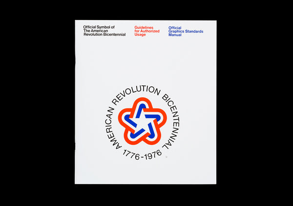
The 1976 American Revolution Bicentennial symbol was the logo for America’s 200th birthday party and a precursor to the NASA logo that Bruce Blackburn would design in 1974.

This edition is a perfect facsimile of the original, wrapped in a black jacket with a foil stamped foreword from Bruce Blackburn and an essay from Christopher Bonanos. The first 1,976 copies are limited edition, featuring a hand-placed original bicentennial post stamp from ’76.

Specifications

52 pages + 8 panel jacket
49 image plates
9.5 × 11"
24.1 × 27.9 cm
4 Pantone® spot colors
Stochastic screen
Saddle stitched in same position as original
Foil stamped jacket
Blind embossed jacket
170/300 gsm Scheufelen Heaven 42
300 gsm Colorplan ebony
Printed in USA

International Orders

For orders outside of U.S., Canada, and Mexico, please visit our friends at Counter Print.

American Revolution Bicentennial reissue front cover

Notes

Copyright

“A Star Is Born”
© 2016 Bruce Blackburn

“The Spirit and Swoop of ‘76”
© 2016 Christopher Bonanos

Photography

Brian Kelley

ISBN

978-0-692-77468-7